Week 1:
Feedbacks & Reflection:
- the “sketches” are too broad –> what specific memory?
- the research feels closed –> do I already know what I’m going to learn from this studio exploration?
- systems –> theme can become the medium and subject is the material
- “Random Failures” idea
- has a point & medium
- what disturbs the pattern?
- how does designers work against pattern
- can a system undo itself?
- find a medium that resist a system?
Week 2:
- look at signages
- why this medium? –> randomness = malfunction –> signs are suppose to prevent randomness, and introducing randomness feels like the system is undoing itself
- I want to explore how systematic design can generate instability when parameter are pushed or misused
Disrupting UK Road Signages
Arrows:
- change arrows to different directions
- duplicate arrows in opposite directions inside one sign
Icons:
- swap icons
- place multiple icons within one sign
Typography:
- replacing to different font or language
- testing the size of the type
Layout:
- shift texts into off-grid –> almost touching the boarder
- rotating elements
Overload:
- repeat or place multiple graphical factors in one sign
Absence:
- intentionally remove essential information or graphics from the signs
Feedbacks & Reflection:
- Another view of systems? –> began to think beyond just road signs –> system as part of daily life
- How people perceive each sign can be really difference depending different contexts like culture, nationality, age, etc
- Maybe compare the signs from different countries then compare & contrast
- Malfunctions in literature?
- Averaging –> Smoothing –> creates different engagement
- what it teaches VS what gets lost
- introduce malfunction through:
- smoothing & averaging
- randomness –> but then what’s the purpose? what can I learn from this process?
Week 3:
- signs can be very subjective based on language and culture –> compare signages from different countries
- *instructions – prompts – guidance*
- “Malfunction”
- through averaging & smoothing
- spatial smoothing –> what gets lost in the process?
- visual bridges
- signages if they didn’t go through “smoothing”?
- then compare what got lost in the process
- what change din the smoothing process?
Week 4
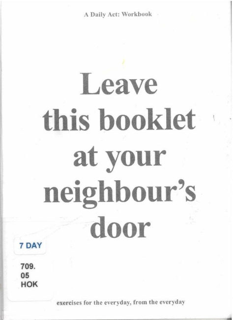
Atelier Hoko’s A Daily Act: Workbook
- link this reference to signages? –> create personalized icons / signages
*Microgarphics?
- choose an object & explain it in detail using signage & micro graphics aesthetics?
- Karina Yazylyan (https://www.behance.net/gallery/73516343/Aesthetics-of-technical-information-(visual-research))
- exploring the visual language of utilitarian making, from production labels to fashion
<Smoothing>
- in cartography: Smoothing diminishes detail and angularity, might displace some point and add others to the list. A prime objective of smoothing is to avoid a series of abruptly joined straight line segments (How to Lie with Maps by Mark Monmonier)
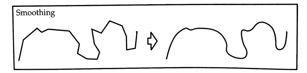
- Smoothing in design system:
a reductive process in design standardization that prioritizes clarity, efficiency, and universality by erasing specific, singular, and “non-essential” details.
*Need to look at what malfunctions the smoothing process can cause
*importance of Unsmoothing?
- The process of using “friction,” “malfunction,” and “visual pollution” as critical tools to deliberately re-introduce the specific, singular context that was erased by standardization
Week 5:
- designing a speific, singular forms/experience
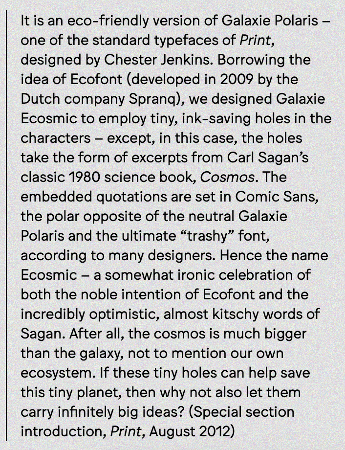
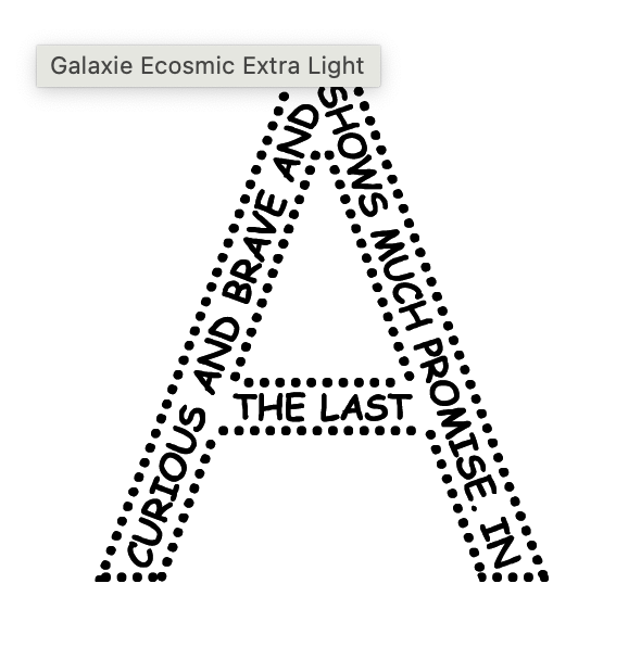
Galaxis Ecosmic Type by Sulki&Min (https://www.sulki-min.com/wp/galaxie-ecosmic/)
*Further Studio Exploration
Personalized Type?
- a very personal text/information that we own or encounter every day?
- text messages
- song lyrics
- recently used emojis
- old memo
- name in mother tongue language
- family recipe
- receipts
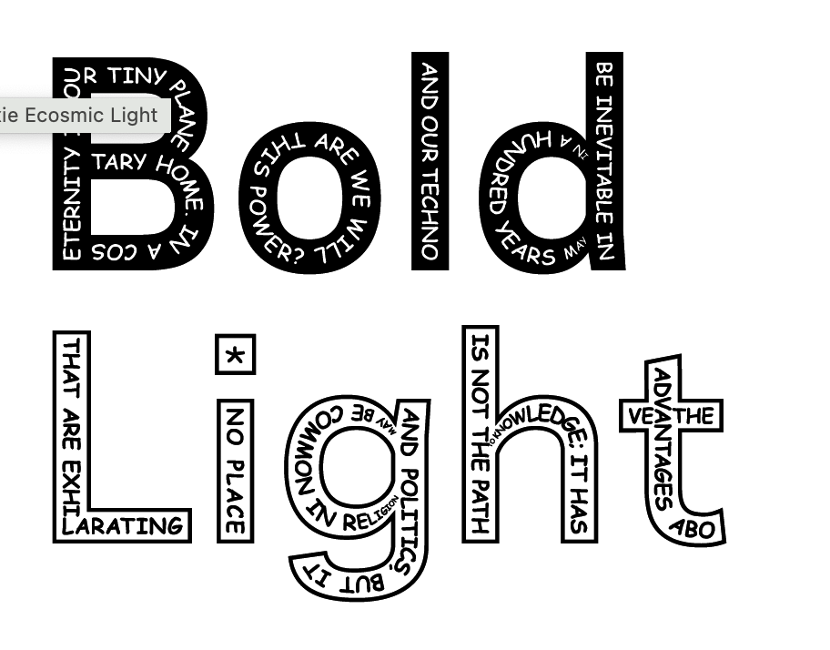
1. Reclamation of specific, singular reality
- Universal System: Standardized fonts (Helvetica, Times New Roman, etc.) are themselves ‘universal systems’ that hide their own cultural biases.
- Creating typography based on ‘specific, singular reality’ –> brings the very ‘specific context’ that standardization was designed to erase directly into the design as its core material
2. Systems that require cultural specificities
- This is that project.
- ‘personal texts’ are the user’s ‘cultural data’
- without this data (text), the typographic ‘form’ cannot be generated at all
- a design framework that requires user participation or cultural specificities to function
3. “Unsmoothing” and critical engagement
- deliberate friction
- critical engagement
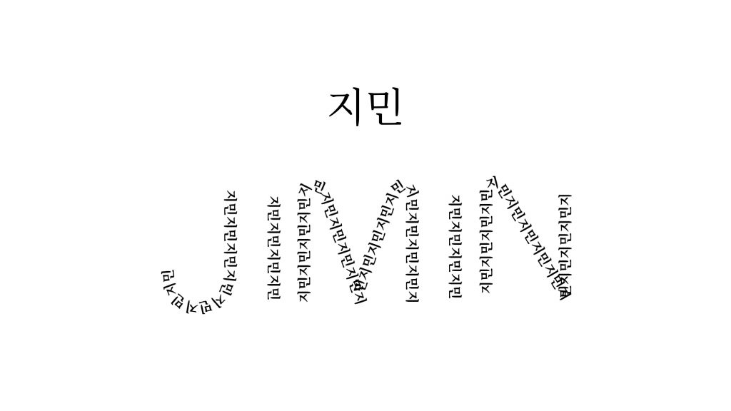
My name, Jimin, written by inserting the Korean version of my name 지민
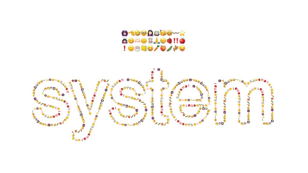
Letters formed with recently used emojis